Netnotes: Your Networking Buddy
OVERVIEW
This project dives into the creation for the mobile app Netnotes, a personal networking buddy for students. Through three months of research, design, and testing, we developed a prototyped app design to aid students in one of the most important skills they will learn in college: networking! Netnotes makes this experience more intuitive with automated reminders, note-taking, and an information storing profile.
RESEARCH
Networking Not Working
Needfinding
To better understand the student networking experience, I conducted early needfinding through informal conversations with peers and reflection on common struggles. This led to identifying a core gap: students lacked an intuitive system for tracking interactions and felt unsure about when and how to follow up. These insights shaped our initial design goals.
RESEARCH
How Do You Network?
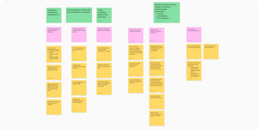
Moderated Interviews
We conducted 7 semi-structured interviews with students of varying experience levels to uncover the pain points of digital networking. Through affinity mapping, we found that students struggled most with retaining connections, lacked confidence, and preferred deeper connections over wide-reaching networks. These findings guided the app’s core features.
RESEARCH
It's About the Journey
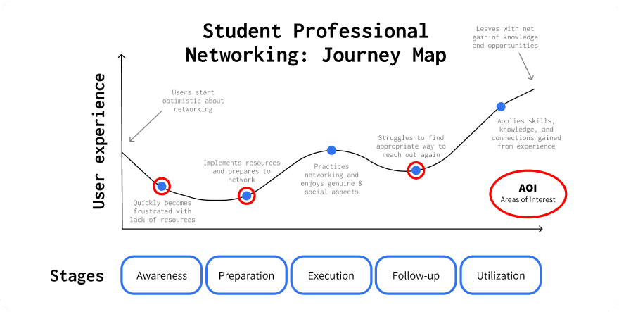
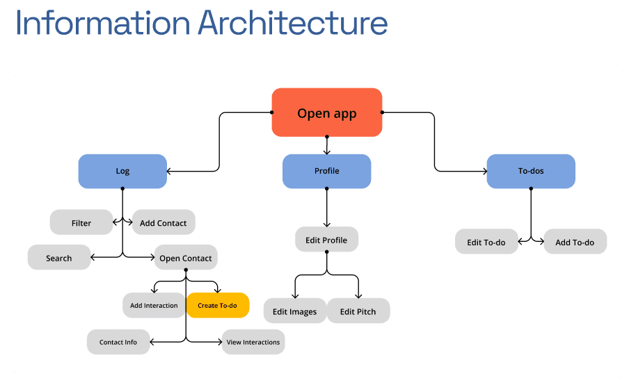
Journey Map & Info Arch
We mapped out the networking journey from preparation to execution and follow-up, revealing key drop-off points where students lose momentum, especially during re-engagement. Using these insights, we constructed an information architecture that made interaction tracking, reminders, and contact management as frictionless and encouraging as possible.
DESIGN
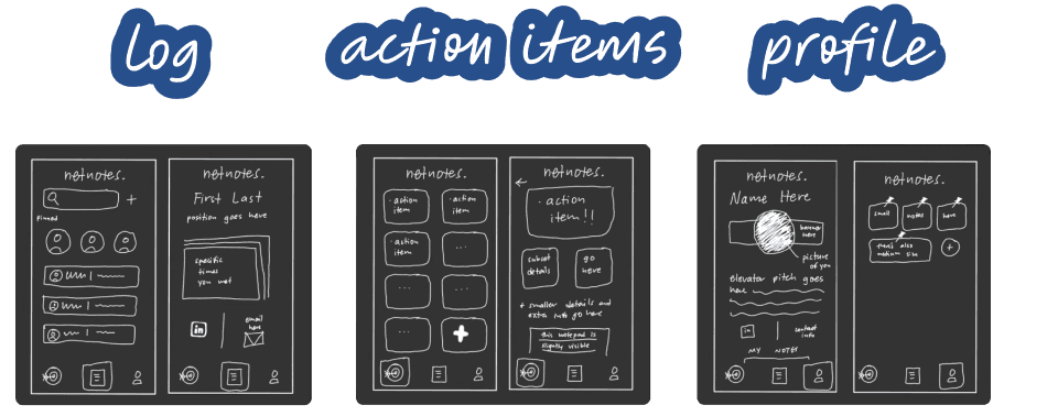
Low Fidelity
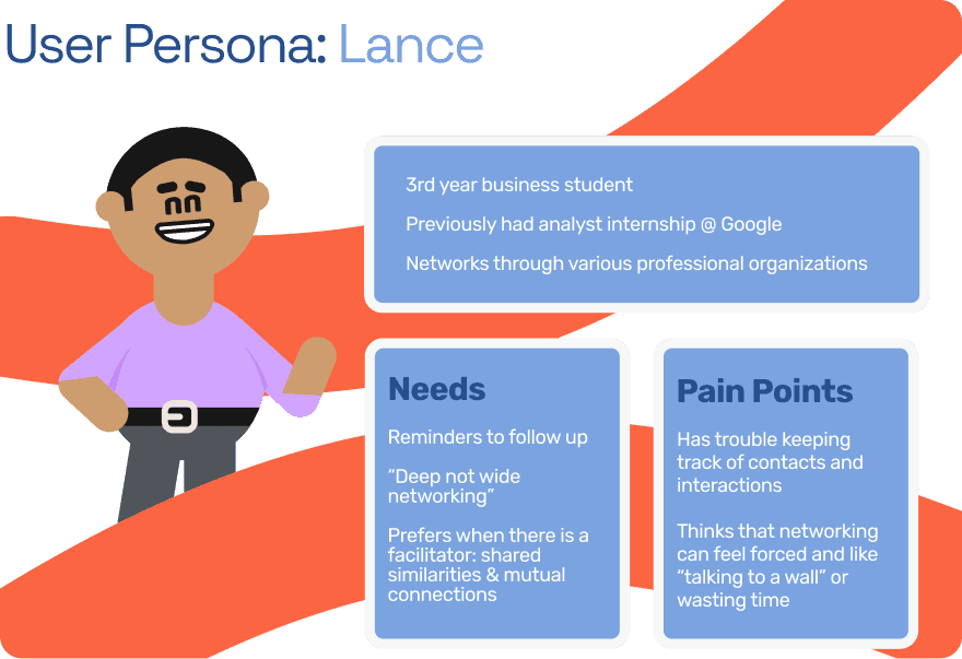
Using interview data, we developed a primary persona named Lance, a business student who values meaningful connections but struggles to keep track of them. We designed low-fidelity wireframes around his needs, prioritizing quick access to follow-ups, interaction logs, and contact-based to-dos.
DESIGN
Mid Fidelity
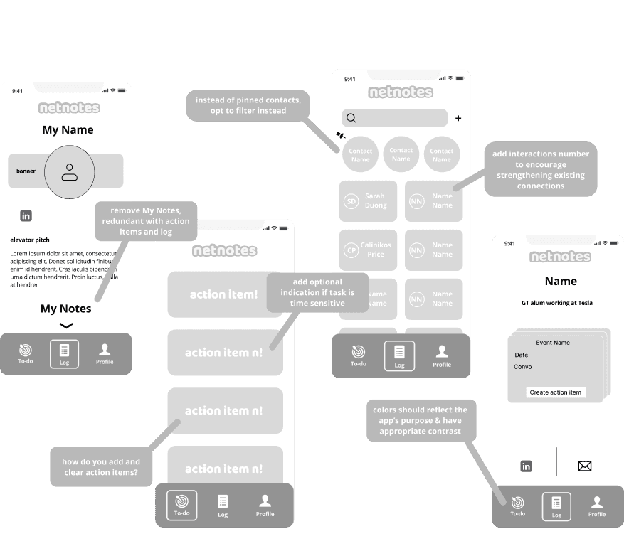
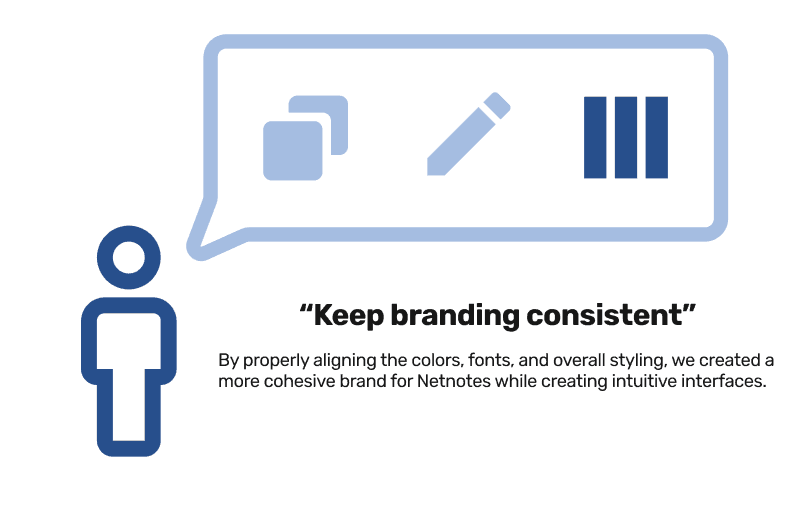
We transitioned our sketches into interactive mid-fidelity wireframes in Figma. Here, we began testing layout clarity, button placement, and task flows — refining how users add, view, and update contact interactions. Feedback during this stage helped us focus on decluttering and strengthening the visual hierarchy.
RE-RESEARCH
Netnote-taking
User Testing
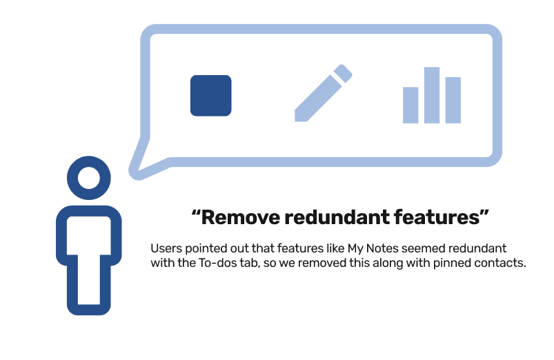
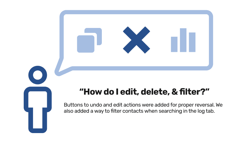
Through task-based testing with potential users, we identified confusion around redundant features like the “My Notes” section and refined our interaction flow to support more intuitive use. Iterative testing confirmed that focusing on fewer but more intentional actions led to a smoother and more confident user experience.
DESIGN
Final Designs
The final app design aimed to aid students in the networking process through offering a variety of features, information heuristics, and improved experiences at pain points.
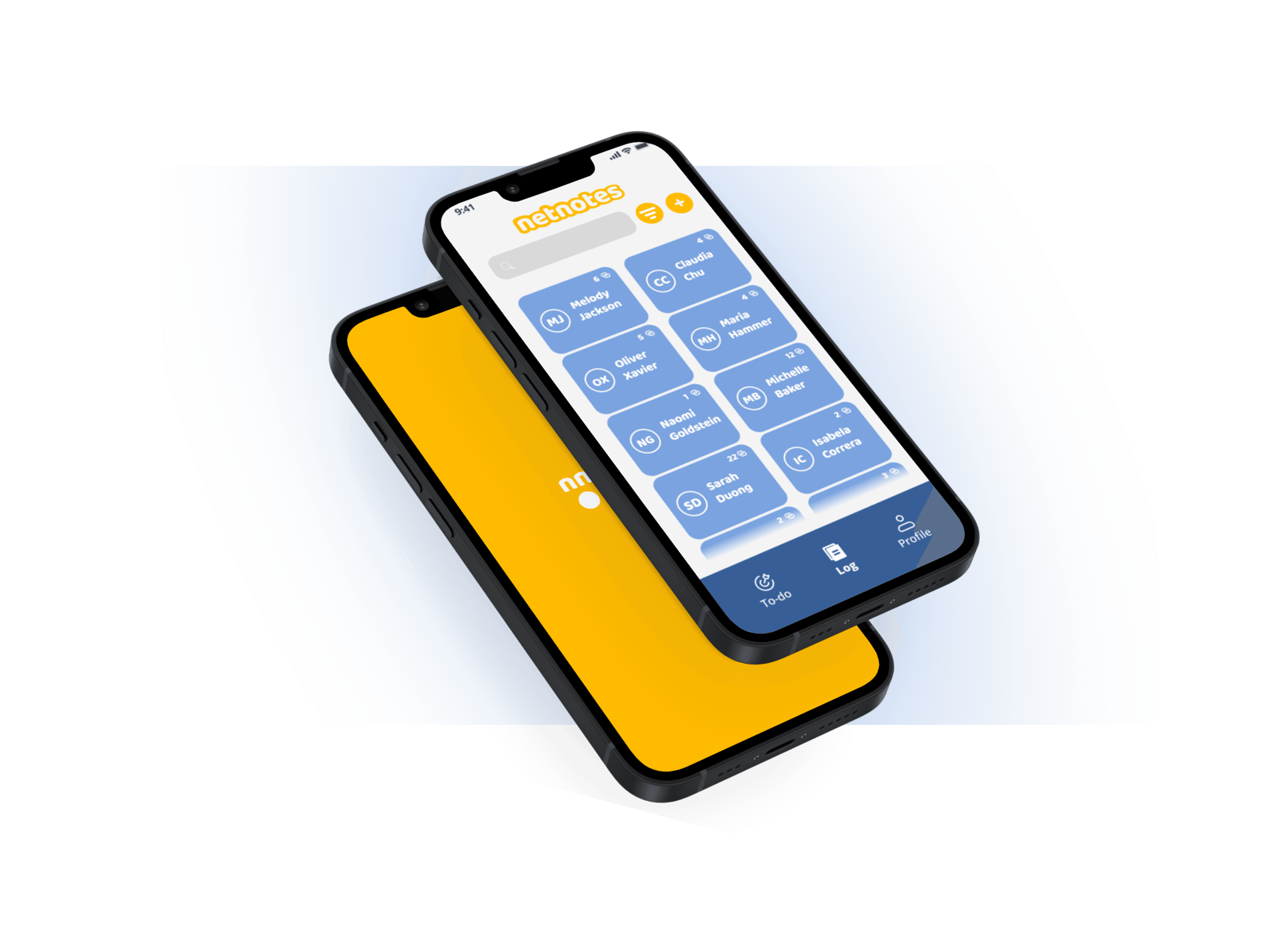
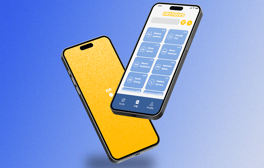
DELIVERABLE
Mobile App UX Design
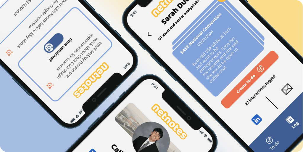
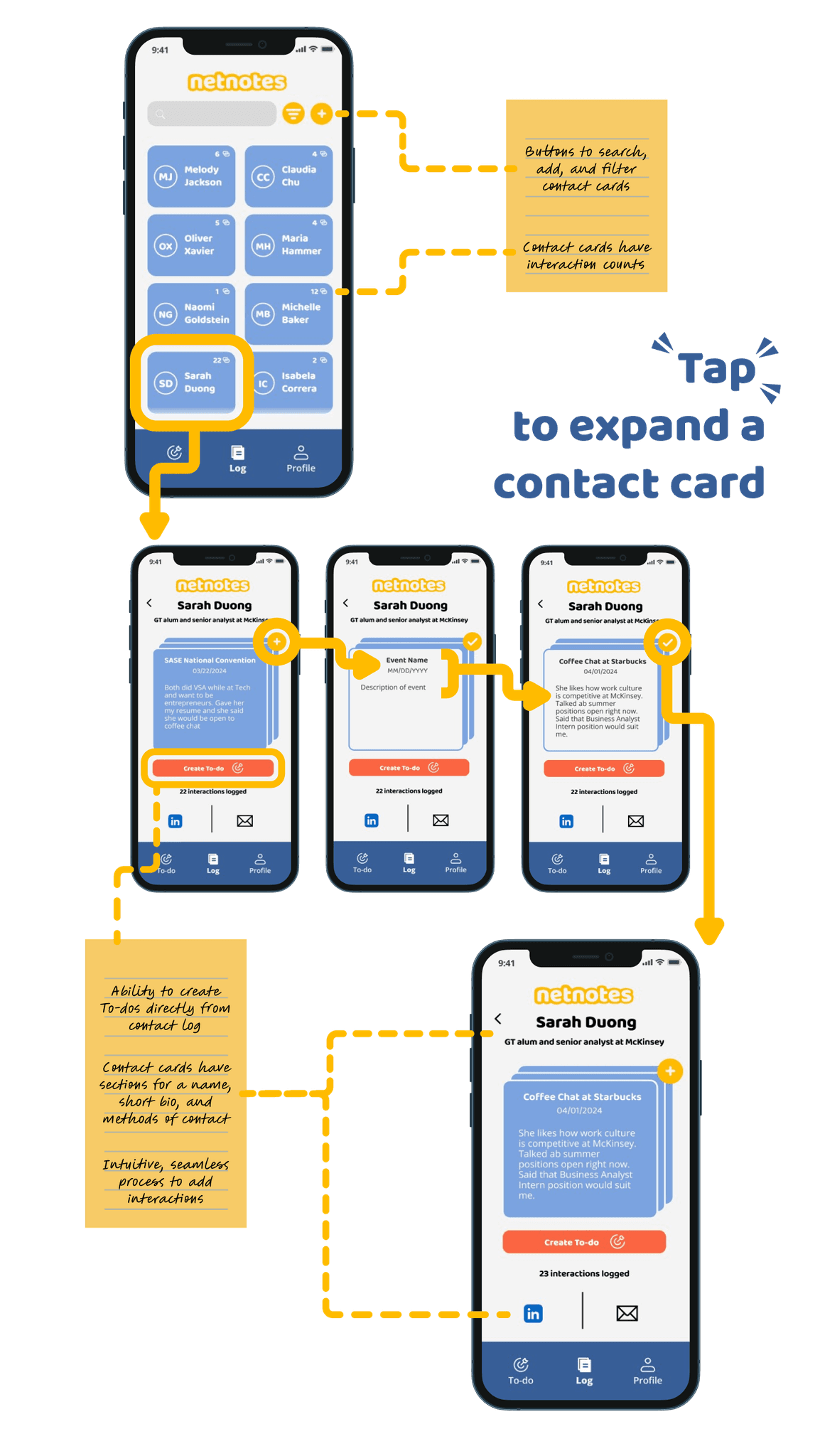
Log
The contact log allows users to view and filter cards, track interactions, and add follow-up tasks, all from one screen. By embedding subtle features like interaction counts and optional time-sensitivity tags, we made it easier to maintain relationships without overwhelming the user.
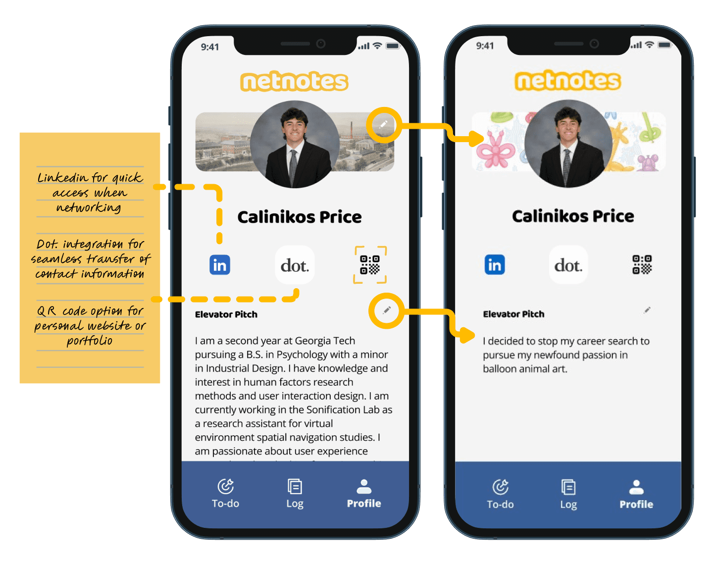
Profile
The profile serves as a personal networking hub, offering users editable sections like bios, contact methods, and QR code integration for seamless sharing. By consolidating these touchpoints, we empower users to present themselves confidently while remaining adaptable in different networking environments.
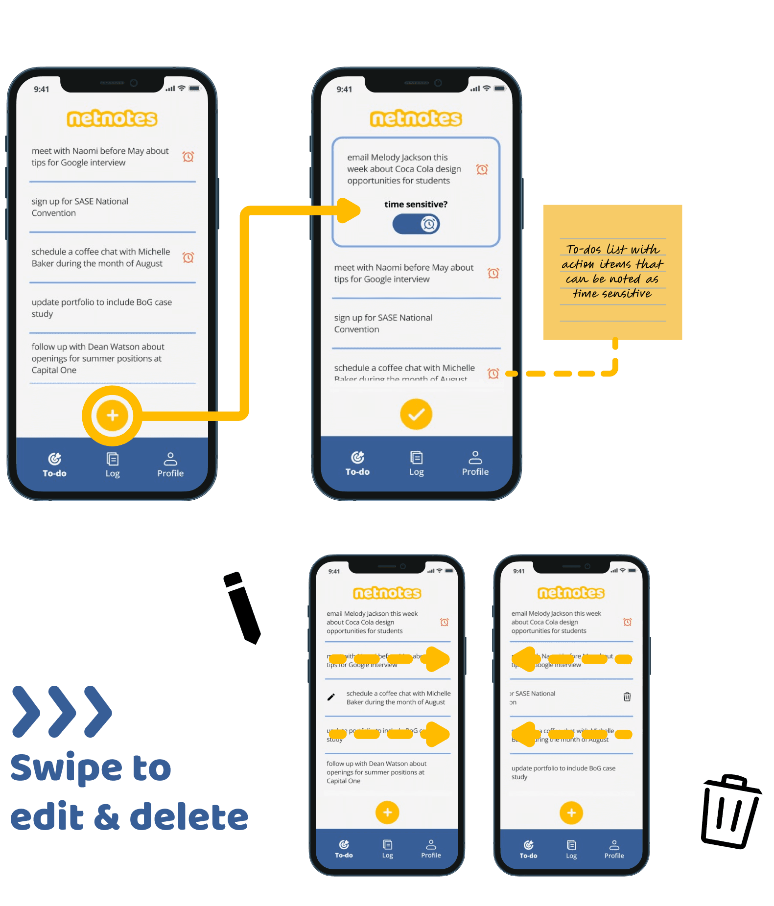
To-do
The to-do system is integrated into the contact log and serves as a lightweight reminder tool. Users can create actionable follow-ups directly from interactions and mark them as time-sensitive if needed. This feature supports users in turning conversations into long-term connections.
THE END
Nuggets of Wisdom
This process as a whole helped me realize that slowing down the design process to ensure its quality beats having more output. This approach enhances the user experience by reducing cognitive load and making interactions more intentional. User testing is also invaluable. It provides insights into how users interact with the app, uncovering usability issues and areas for improvement that might not be evident to designers initially. This project helped me realize that this process ensures product are user-centered, effective & efficient, and meets the true needs of their audience.