Mental Health Monitoring:
Making Therapy Efficient & Effective
OVERVIEW
This project explores the development of a mental health monitoring dashboard designed to support therapists in tracking patient progress between sessions. The goal was to integrate AI-driven insights, user-friendly data visualization, and a structured interface to enhance clinical preparation sessions. By prioritizing efficiency and accessibility, the dashboard enables therapists to provide more personalized and data-driven care.
Tags
Timeline
Tools
Team
Figma
V. Bhatnagar, Developer
Microsoft Suite
Highcharts
Dr. B. Walker, PI
Primaface , AI Integration
UX Research
Usability Testing
Moderated Interviews
Dashboard Design
4 months
Git
RESEARCH
Coffee Chat With The Experts
Moderated Interviews
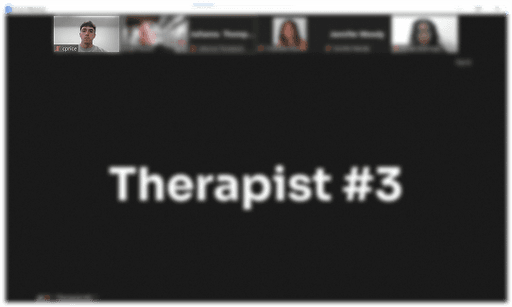
Understanding therapist needs was a crucial first step, so I conducted 6 rounds of moderated interviews with 3 therapists to explore how they currently track patient progress between sessions. These discussions provided insights into workflow inefficiencies, data interpretation challenges, and the potential for AI-assisted analysis. Findings from this phase directly informed key design decisions to align the tool with clinical workflows.


RESEARCH
Needs In The Weeds
Needs Analysis
Through a deep dive into therapist workflows and patient engagement strategies, I identified core pain points in existing mental health tracking systems. Many therapists relied on manual notes or fragmented tools, leading to inconsistencies in retained information. The needs analysis helped define essential dashboard features, ensuring an intuitive and structured approach to patient monitoring.
pictoral
iconography
trends & insights
actionable data
IDEATION
Design. Test. Repeat.
With research insights, I began the design phase by creating low-fidelity wireframes and interactive prototypes. Refinements were made through utilizing user feedback, emphasizing ease of navigation, data clarity, and actionable insights. This iterative approach ensured that every design decision aligned with real therapist needs and usability expectations.
IDEATION
Progress Makes Perfect
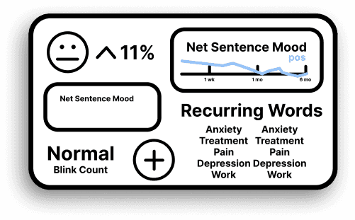
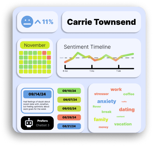
Through multiple rounds of testing and refinement, I improved the dashboard’s data visualization, AI-powered insights, and user interface elements. Risk indications, word summaries, and real-time analytics were introduced to provide a clearer overview of patient progress. Feedback from therapists validated these updates, confirming their impact on improving workflow efficiency and patient engagement.
DELIVERABLES
Final Tool Design
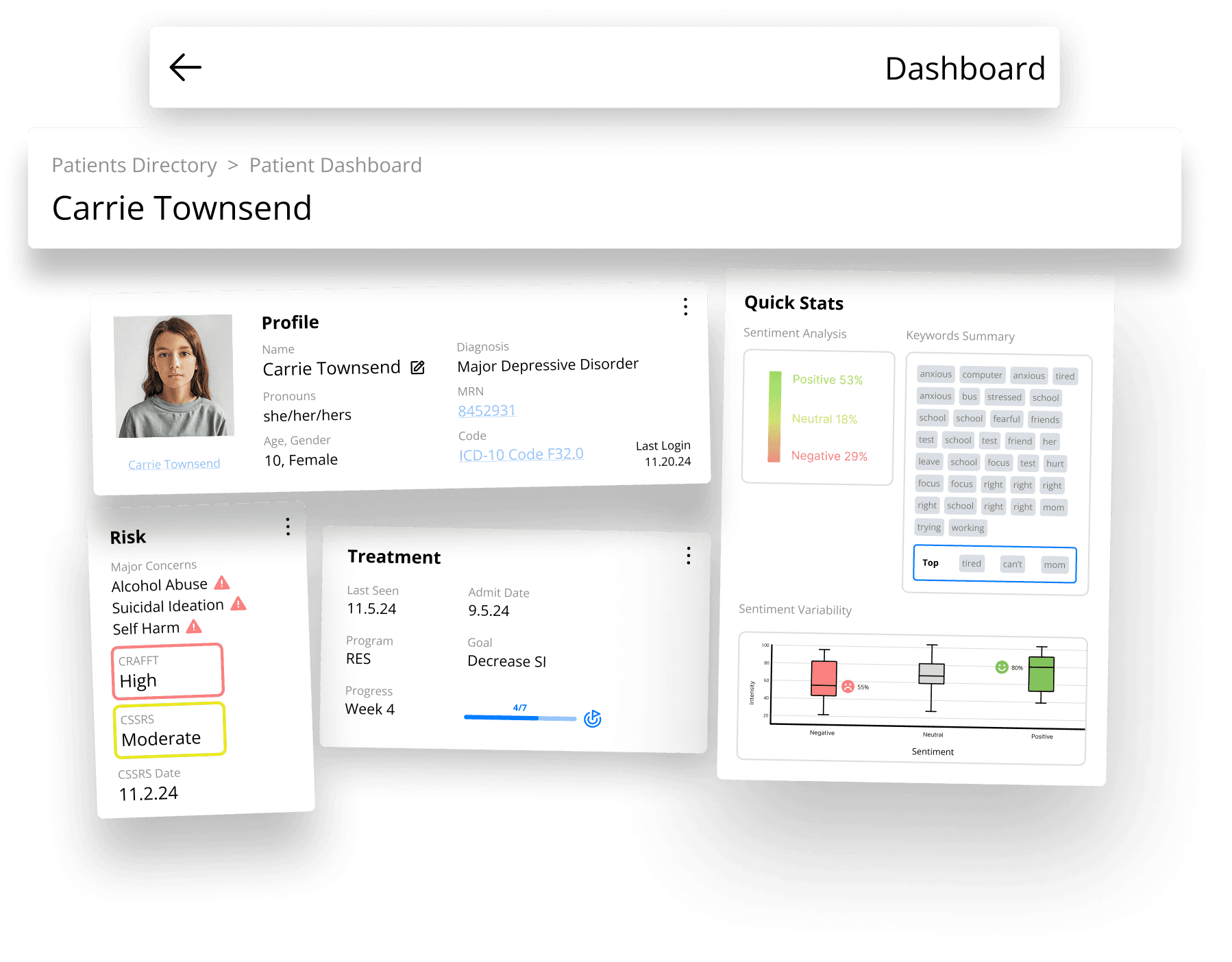
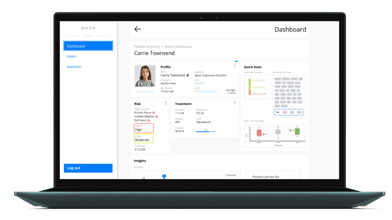
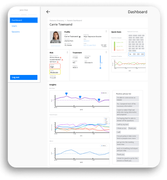
The final dashboard design integrates a structured, therapist-friendly interface that supports real-time patient tracking and AI-driven insights. Its intuitive layout and comprehensive data visualization improve decision-making, enabling clinicians to provide better care with minimal effort. This solution highlights the power of user-centered design in enhancing mental health support systems.
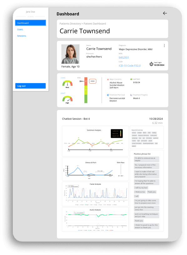
First, compact and efficient visual elements were prioritized to support quick comprehension in clinical workflows. Leveraging user feedback from moderated interviews, the dashboard was structured to display only the most essential patient data: emotional arousal, blink rate, facial expressions, and patient sentiment. To prevent redundancy, the interface was intentionally focused on vital elements for momentary check-ins rather than duplicating information found in traditional medical records.
In response to therapist feedback, I also embedded inclusive design elements, such as fields for preferred gender pronouns and patient triggers, reflecting a broader mental health-informed perspective. These actionable design choices allowed the final dashboard to deliver necessary insights quickly and intuitively, supporting clinical workflows while maintaining an empathetic approach to patient care.
Throughout the iterative design process, I emphasized the importance of user-centered interaction to lead design choices. This led to actionable improvements like incorporating symbolic representations, adding pictoral iconography, and enhancing visual hierarchy for faster glanceability. Momentary-use considerations guided decisions to balance clarity, conciseness, and error prevention. Clinical metrics were visualized through meaningful symbols and color coding, helping reduce cognitive load for therapists with high caseloads.
THE END
Nuggets of Wisdom
This project reinforced two key lessons: user voices matter most and intuitive principles create usable design. Direct insights from therapists shaped every design decision, proving that listening to end users is essential for creating truly impactful tools. A seamless, intuitive interface is just as critical as advanced functionality—without usability, even the most powerful features lose their value. Prioritizing user needs and intuitive design principles ensured that this dashboard became a tool that enhances, rather than complicates, the therapeutic workflow.